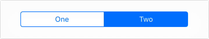
SegmentedControlIOS
Use SegmentedControlIOS to render a UISegmentedControl iOS.
Programmatically changing selected index
The selected index can be changed on the fly by assigning the selectedIndex prop to a state variable, then changing that variable. Note that the state variable would need to be updated as the user selects a value and changes the index, as shown in the example below.
Example
<SegmentedControlIOS
  values={['One', 'Two']}
  selectedIndex={this.state.selectedIndex}
  onChange={(event) => {
    this.setState({selectedIndex: event.nativeEvent.selectedSegmentIndex});
  }}
/>
Props
Reference
Props
enabled
If false the user won't be able to interact with the control. Default value is true.
| Type | Required |
|---|---|
| bool | No |
momentary
If true, then selecting a segment won't persist visually. The onValueChange callback will still work as expected.
| Type | Required |
|---|---|
| bool | No |
onChange
Callback that is called when the user taps a segment; passes the event as an argument
| Type | Required |
|---|---|
| function | No |
onValueChange
Callback that is called when the user taps a segment; passes the segment's value as an argument
| Type | Required |
|---|---|
| function | No |
selectedIndex
The index in props.values of the segment to be (pre)selected.
| Type | Required |
|---|---|
| number | No |
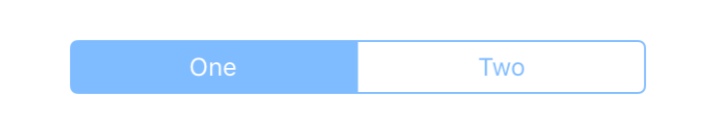
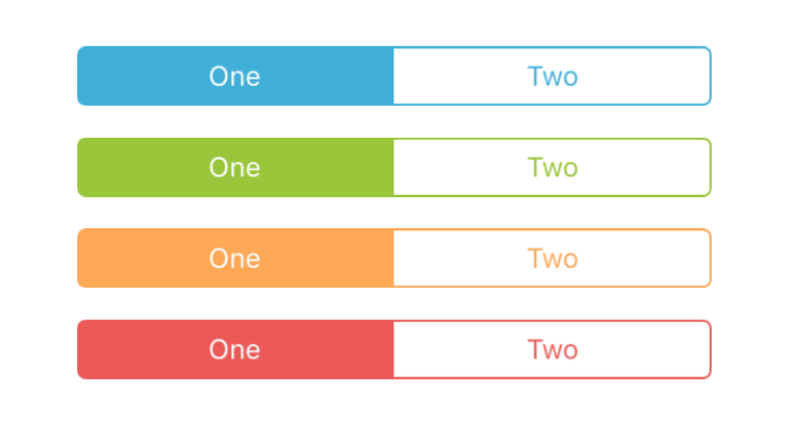
tintColor
Accent color of the control.
| Type | Required |
|---|---|
| string | No |
values
The labels for the control's segment buttons, in order.
| Type | Required |
|---|---|
| array of string | No |